Ever found yourself mindlessly scrolling through LinkedIn, only to hit the brakes on a carousel? There’s a reason. LinkedIn carousel posts – ergo, PDF uploads – are engaging, memorable, and effectively stopping that scroll in 2025.
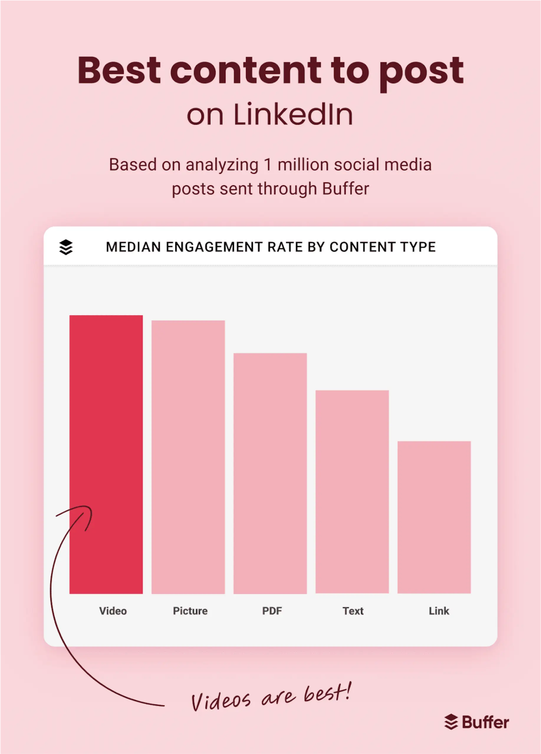
Engagement benchmarks confirm this: multi-image posts garner an average of 6.6% engagement, while document-style posts (carousels) hit 5.85%, narrowly trailing behind but outperforming videos at 5.6%.
Another study from Socialinsider ranks multi-image and carousel posts atop engagement charts.
If you’re asking “Are LinkedIn carousel posts worth it in 2025?” – the answer is a strong yes. But only when done right.
So it’s not just a word count for the sake of it – it signals a more substantive, content-rich section that follows, packed with meaningful tips, strategies, or analysis.
Table of Contents
What Are LinkedIn Carousel Posts?
If you’ve seen a post on LinkedIn that says “Swipe →”, that’s a carousel. It’s just a PDF you upload – each page becomes its own slide. Simple.
But here’s why they matter: instead of cramming everything into one block of text, carousels let you break things down – one idea per slide. That makes them easier to read, easier to remember, and way more shareable.
You can use them to:
- Teach a concept step-by-step
- Share a quick tutorial or checklist
- Tell a story, visually
They’re not fancy. But when done right, they get saved, shared, and revisited way more than regular posts. Not sure what a LinkedIn carousel actually is? This post is a great example 👇
The Evolving Value of Carousel Posts
1. Proven Formula with New Benchmarks
Carousel posts have become LinkedIn classics – they are predictable winners. Buffer’s experiment showed PDFs consistently earned top-three engagement, with carousel posts nearly as engaging as images.

Contentdrips research indicates carousel posts average 24.4% engagement vs just 6.7% for text alone.
Here are two refreshed, insightful points designed for your blog—each comes with a suggested visual you can add to reinforce the message:
2. Real-Time Analytics = Smarter Content Decisions 📊
When you post a carousel, you don’t just hope it lands – you learn exactly how it did. Swipe-through rates, time spent, and scroll depth are all visible in your LinkedIn analytics dashboard. These insights tell you:
- Which slide got the least attention → tweak the hook or visuals
- When people drop off → refine pacing or shorten
- What resonated most → double down on data, storytelling, or visuals
3. Showcase Trends & Thought Leadership – Visually
Carousels are perfect for sharing curated insights or trend data, like a quick “2025 Remote Work Trends” series:
- Slide 1: Bold stat + question (“70% of teams now WFH – how has this shaped your collaboration?”).
This post has done this beautifully 👇
- Slides 2–4: Short points with mini-charts or icons – e.g., “10% increase in productivity,” “Hybrid model rising,” “Hiring bias shifts”
- Final slide: CTA (“Swipe → What’s your remote trend? Comment below”)
Anatomy of a High‑Performing Carousel
1. Hook Slide That Stops the Scroll
Start strong with contrast, a question, or a bold stat.
Example: “Why 90% of carousel slides fail (and how to fix yours)”.
2. Minimalist, Mobile-First Design
- Recommended size: 1080×1080 px or portrait 1080×1350.
- Slides count: 5–15 slides; 10–30 words per slide.
- Crisp fonts, consistent formatting, generous whitespace for readability.
3. Visual Storytelling
Combine charts, quotes, icons, and visuals. Brands like Gartner and Canva excel with clean infographics and product walkthroughs. B2B marketers can adapt these visuals to industry insights or case‑study pain points.
4. Interactive Call‑to‑Action
Ask mid-slides to comment, vote, or repost. Native interactivity (poll slide, question prompt) creates two-way engagement that helps the algorithm.
For example,
5. Strong Finale & External Hook
Conclude with a concise takeaway and clear action – e.g., “Learn more via link below” or “Want the template? Comment 🔥.” Your most important CTA should be readable at thumb-tap distance.
Technical Specs & File Optimisation
- Accepted formats: PDF (preferred), PPT(X), DOC(X).
- Slide limit: Up to 300 pages, but best kept to ≤15 slides.
- File size: Under 100 MB; optimise visuals to stay closer to ~10 MB for faster loading.
What Makes a Carousel Actually Work?
We’ve all seen carousels that feel like a PowerPoint from 2009. And then there are the ones you can’t stop swiping through. What’s the difference? Here’s what we’ve learned from testing, posting, and yes – scrolling a lot ourselves:
- Start with purpose
Are you teaching something? Telling a story? Selling an idea? Before you design anything, know what your reader should walk away with. - Map it like a story, not a pitch
Good carousels have flow. Slide 1 pulls you in, Slide 2 builds curiosity, and by Slide 5, you’ve got real value. Think chapters, not just slides. - Your first slide = your headline
If the cover doesn’t stop the scroll, no one’s seeing what’s inside. Make it bold. Make it specific. Think “5 Hiring Red Flags I Learned the Hard Way” – not “Thoughts on Hiring.” - Design for thumbs, not desktops
Most people view LinkedIn on mobile. Use big text, clean fonts, and layouts that don’t crowd the screen. If someone has to pinch to read, you’ve lost them. - Stay visually consistent
Pick 1–2 fonts, a core colour scheme, and stick to it. Carousels are part of your brand – make sure they look like they came from you. - Leave space to breathe
Every slide doesn’t need to be full. Empty space helps focus attention. It’s not blank – it’s intentional. - Use contrast to guide attention
Light background, dark text. Or vice versa. Make key lines pop. If it’s all the same, nothing stands out. - Guide the swipe
Use arrows. Number your slides. Add “Swipe →” on the bottom corner. Make it frictionless to go forward. - Don’t forget your final slide
That’s your moment. Wrap up with a takeaway, a link, or a CTA like “Want the template? Comment below.” Let people know what to do next. - Show up when it goes live
The first hour after posting matters. Reply to comments, like replies, drop a thank-you. It tells the algorithm: “This post is alive.” - Test your covers
Try different hooks and designs. One might flop, another might take off. You’ll never know if you don’t test. - Stretch your content
Great carousels can live multiple lives – turn quotes into single-image posts, write a thread from the slides, or expand it into a blog (like this one).
These aren’t hacks. They’re habits. Follow them consistently, and your carousels won’t just look good – they’ll perform well and build trust.
Tools & Workflows That Save Time
1. Canva & Adobe Tools
Templates with consistent layouts reduce setup time; Canva’s prebuilt carousels and Adobe Express templates support easy export as PDFs.
2. AI-Driven Formatting
Tools like Draftly, StoryChief, AICarousels, and Taplio help structure and generate slides from outlines. But always refine AI copy/design to preserve tone.
3. Batch & Schedule
Design 2–3 carousels at once, schedule via tools like Buffer. Posting regularly – 1/week – keeps your audience primed.
Content Strategy & Posting Optimisation
1. Diversify Formats
Carousels should complement your mix: videos, single image posts, text insights, polls. LinkedIn users crave variety.
2. Optimal Timing
Best engagement occurs around 10–11 am local time on Tues/Thurs. For IST audiences, that’s a perfect LinkedIn window.
3. Fast Engagement
Respond to comments quickly. A strong first hour signals an algorithm boost.
4. Internal Linking
In PDF slide notes, use unobtrusive references to your blog articles, turning carousels into lead funnels.
5. Repurpose Content
Turn carousels into blog posts, newsletters, and stand-alone templates. The PDF is evergreen lead magnet material.
People-First LinkedIn Carousel Content
1. Understand Audience Needs
Don’t create carousels for the sake of format. Use your own experience – e.g., “My 5 funnel-building mistakes”- to offer compelling lessons.
2. Demonstrate Expertise
Slide decks should reflect lived experience and outcomes – case studies, metrics, and quotes. It proves your credibility.
3. Clarity & Satisfaction
Readers should walk away feeling they learned something meaningful, whether a new formula or actionable insight.
4. Emotional & Logical Flow
Start with empathy (“I struggled too…”). Transition to guidance, supported by data and ending with empowerment.
Frequently Asked Questions (FAQs)
1. How many slides are ideal?
Typically 5–15 slides (~10 words each) to maintain attention without overload.
2. Can I use animations or GIFs?
No-link carousels are treated as PDFs. Use static images only.
3. Should I add download links?
Yes, prompting to download encourages deeper engagement and saves.
4. Is there value in carousel ads?
Absolutely! Organic posting vs. paid carousel ads each serve different strategic goals, but both benefit from the same principles.
5. How to measure success?
Track impressions, engagement rate per impression, CTRs on CTAs, comments, saves, and PDF downloads.
Conclusion & CTA
LinkedIn carousel posts remain a standout format in 2025. With strong algorithm favour, they’re indispensable – but only when crafted with intention and audience empathy.
Start with:
- Blueprint: Sketch 1 carousel per week.
- Toolkit: Use Canva + AI tools like SuperPen, then edit personally.
- Execution: Post on Tue/Thu @ 10 am.
- Engage: Reply fast and repurpose content.
Ready to elevate your brand on LinkedIn?


